Miss-classification analysis#
In this example we analyze the miss-classifications of the random shapelet forest and the nearest neighbour classifier.
[1]:
import matplotlib.pyplot as plt
import numpy as np
from sklearn.decomposition import PCA
from sklearn.model_selection import train_test_split
from sklearn.neighbors import KNeighborsClassifier
from sklearn.pipeline import make_pipeline

from wildboar.datasets import load_dataset
from wildboar.ensemble import ShapeletForestClassifier, ShapeletForestEmbedding

random_state = 1234
First, we load a dataset and define the training and testing partitions.
[2]:
x, y = load_dataset("Car")
x_train, x_test, y_train, y_test = train_test_split(
    x, y, test_size=0.2, random_state=random_state
)
Next, we define a pipeline that projects the dataset to a 2-dimensional plane using the shapelet forest embedding and pricipal component analysis.
[3]:
f_embedding = make_pipeline(
    ShapeletForestEmbedding(sparse_output=False, random_state=random_state),
    PCA(n_components=2, random_state=random_state),
)
f_embedding.fit(x_train)
x_embedding = f_embedding.transform(x_test)
Finally, we define the classifiers we want to train, test, analyze and plot.
[4]:
classifiers = [
    ("Shapelet forest", ShapeletForestClassifier(random_state=random_state)),
    ("Nearest neighbors", KNeighborsClassifier()),
]

classes = np.unique(y)
n_classes = len(classes)

fig, ax = plt.subplots(
    nrows=len(classifiers),
    ncols=n_classes,
    figsize=(3 * n_classes, 6),
    sharex=True,
    sharey=True,
)
for i, (name, clf) in enumerate(classifiers):
    clf.fit(x_train, y_train)

    y_pred = clf.predict(x_test)
    probas = clf.predict_proba(x_test)

    for k in range(n_classes):
        if i == 0:
            ax[i, k].set_title("Label: %r" % classes[k])
        if k == 0:
            ax[i, k].set_ylabel(name)

        ax[i, k].scatter(
            x_embedding[:, 0],
            x_embedding[:, 1],
            c="black",
            alpha=0.2,
            marker="x",
        )
        mappable = ax[i, k].scatter(
            x_embedding[y_pred == classes[k], 0],
            x_embedding[y_pred == classes[k], 1],
            c=probas[y_pred == classes[k], k],
            marker="x",
            cmap="viridis",
        )
        ax[i, k].scatter(
            x_embedding[(y_test[y_test != y_pred] == classes[k]).nonzero()[0], 0],
            x_embedding[(y_test[y_test != y_pred] == classes[k]).nonzero()[0], 1],
            edgecolors="red",
            linewidths=2,
            alpha=0.3,
            facecolors="None",
            s=70,
            marker="o",
        )


plt.tight_layout()
fig.colorbar(mappable, ax=ax, orientation="horizontal")
[4]:
<matplotlib.colorbar.Colorbar at 0x7fe0088bbaf0>
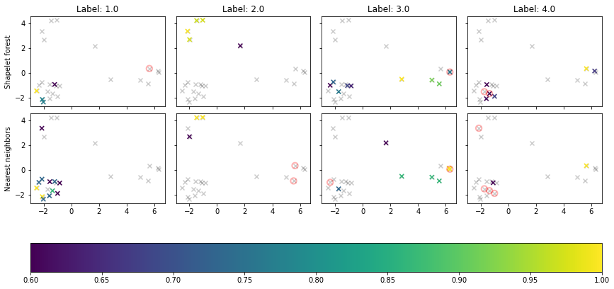
In the above figure, we see the time series as projected by PCA, colored according the predition probability of the corresponding label. Miss-labeled samples are circed in red.