Outlier detection#
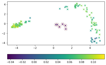
In this example, ShapeletIsolationForest is used to detect outliers. We use the ShapeletForestEmbedding to visualize the time series and mark each sample according to the outlier score assigned by the shapelet isolation forest. True anomalous samples are encircled by a red circle and samples predicted as anomalous are encircled by a black circle.
[1]:
import matplotlib.pylab as plt
from sklearn.decomposition import PCA
from sklearn.model_selection import train_test_split
from sklearn.pipeline import make_pipeline

from wildboar.datasets import load_dataset
from wildboar.ensemble import IsolationShapeletForest, ShapeletForestEmbedding

random_state = 1234
First, we load the dataset from the outlier repository.
[2]:
x, y = load_dataset("CBF", repository="wildboar/outlier:easy")
x_train, x_test, y_train, y_test = train_test_split(
    x, y, test_size=0.2, random_state=random_state, stratify=y
)
Second, we construct a pipeline for projecting time series to a 2-dimensional plane using PCA and the shapelet forest embedding.
[3]:
metric = "euclidean"
embedding = make_pipeline(
    ShapeletForestEmbedding(
        metric=metric, random_state=random_state, sparse_output=False
    ),
    PCA(n_components=2, random_state=random_state),
)
Next, we define an isolation shapelet forest that uses random shapelet trees to isolate outlier samples
[4]:
isf = IsolationShapeletForest(
    contamination=0.05,
    metric=metric,
    random_state=random_state,
    n_jobs=-1,
)
isf.fit(x_train)
embedding.fit(x_train)
x_embedding = embedding.transform(x_test)

y_score = isf.decision_function(x_test)
y_pred = isf.predict(x_test)
Finally, we plot the projection and mark the correct outliers and the samples predicted outliers
[5]:
fig, ax = plt.subplots()
mapping = ax.scatter(
    x_embedding[:, 0], x_embedding[:, 1], c=y_score, cmap="viridis", marker="x"
)
ax.scatter(
    x_embedding[y_test == -1, 0],
    x_embedding[y_test == -1, 1],
    edgecolors="red",
    linewidths=1,
    alpha=0.2,
    facecolors="None",
    s=100,
    marker="o",
)
ax.scatter(
    x_embedding[y_pred == -1, 0],
    x_embedding[y_pred == -1, 1],
    edgecolors="black",
    linewidths=1,
    alpha=0.2,
    facecolors="None",
    s=200,
    marker="o",
)
plt.tight_layout()
fig.colorbar(mapping, ax=ax, orientation="horizontal")
[5]:
<matplotlib.colorbar.Colorbar at 0x7fc218db79a0>